Customer Mars Operating System
🧭 Context
The Customer Mars Operating System (CMOS) is a short-term operating framework designed to standardize meeting structures, enable cross-functional collaboration, improve visibility with the right tools and metrics, and ensure sustainable customer operations.
📝 Brief
Client: Mars, Inc. (via Mu Sigma)
Industry: Global FMCG – Confectionery, Pet Food, Packaged Foods
Project Type: Enterprise Application Design – Digitization of manual and fragmented workflows
My Role: UX Research, Ideation, Prototyping, Interaction Design, and Usability Testing
Timeline: April 2020 – September 2020
Location: Bangalore, India (Remote stakeholders in Nashville, USA & London, UK)
Tools Used: Figma, Optimal Workshop, Mural, Jira, Confluence, Office 365
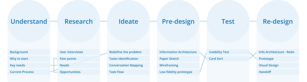
🔄 Design Process
Write something about design process
📚 Background
CMOS is the backbone of inventory planning and order fulfillment at Mars. Previously, teams relied heavily on manual Excel-based tools that were inefficient, lacked transparency, and hindered real-time decision-making. A new system was needed — one that empowered collaboration, enhanced data visibility, and prioritized customer satisfaction.
❓ Why This Project?
To align multiple teams (Sales, Availability, Warehousing, and Customer Relations) under one collaborative system, providing:
Proactive visibility into risks and promotions
Clear accountability and communication workflows
Tools to anticipate stock-outs and customer impacts before they occur
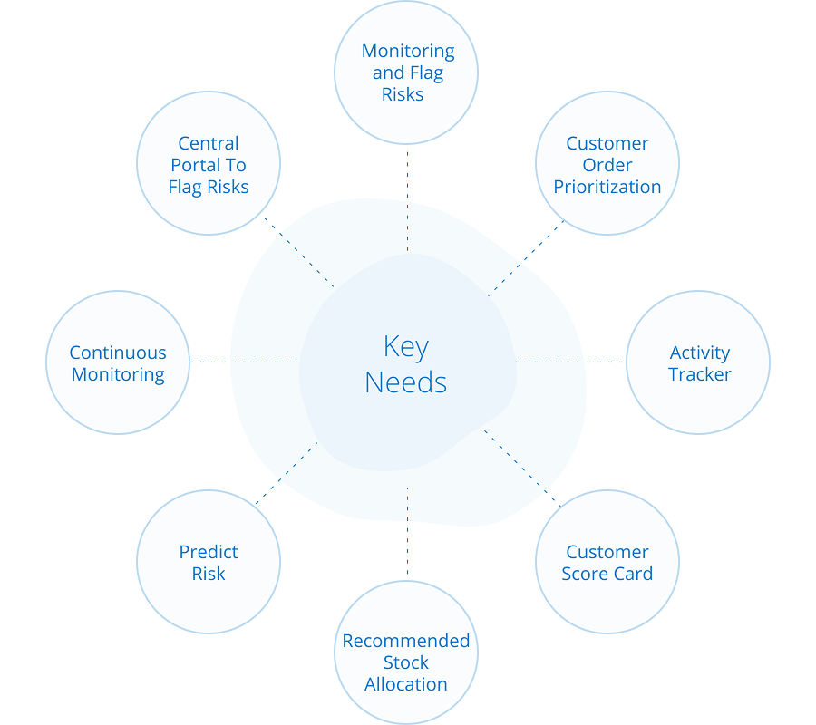
🎯 Key Needs
The platform had to:
Identify potential order/promotional risks early
Provide timeline visibility for upcoming customer commitments
Foster alignment across business units with a customer-first lens
🔍 Understanding the Current State
The existing setup was:
Excel-heavy, slow, and error-prone
Dependent on tribal knowledge and heuristics
Disconnected across departments, leading to inefficiencies
We needed to unify the workflow, standardize decisions, and reduce turnaround time for critical planning.
👥 User Interviews
I conducted in-depth remote interviews with Sales and Planning team members across geographies to uncover their workflows, pain points, and tool usage. We explored:
Daily priorities and decisions
Communication gaps between roles
Challenges with current tooling
Feature expectations from a new system
These interviews shaped our problem understanding and served as the foundation for our design direction.
What is your main goal every morning related to CMOS?
What are the most important decisions you or other people need to take in using the CMOS tool?
How do you come to those decisions in your current ways of working?
How do you communicate decisions made in your ways of working? Who do you communicate with about decisions?
What could make your decision-making easier?
How would you describe your past and current experience with the tool or tools that you use right now?
What do you like about the current tool or process that you follow to perform your daily activities?
What don’t you like about the current tool or process that you follow to perform your daily activities?
Do you have any secondary goals? If yes, please describe.
What would prevent you from achieving your goals?
What improvements could be made to make your goals or decision-making abilities easier or better?
Would you ever need to share these metrics with others? If yes, who, what format, and method of sharing?
Would you ever need to export any information or metric? If yes, what format and method of import?
Under what circumstances would you want to receive an alert or notification in the new tool?
What haven’t we asked you today that you think would be valuable for us to know?
May I contact you if we have any other questions or for possible further research for this project?
💡 Insights
Through user interviews, I could figure out a few insights.
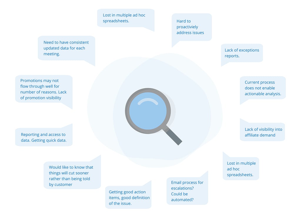
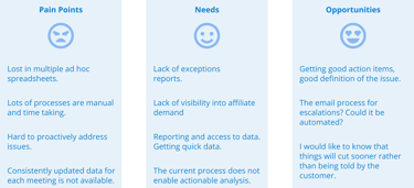
🧩 Findings
I converted the Research Insights to
Pain Points, Needs and Opportunities

Redefining problem
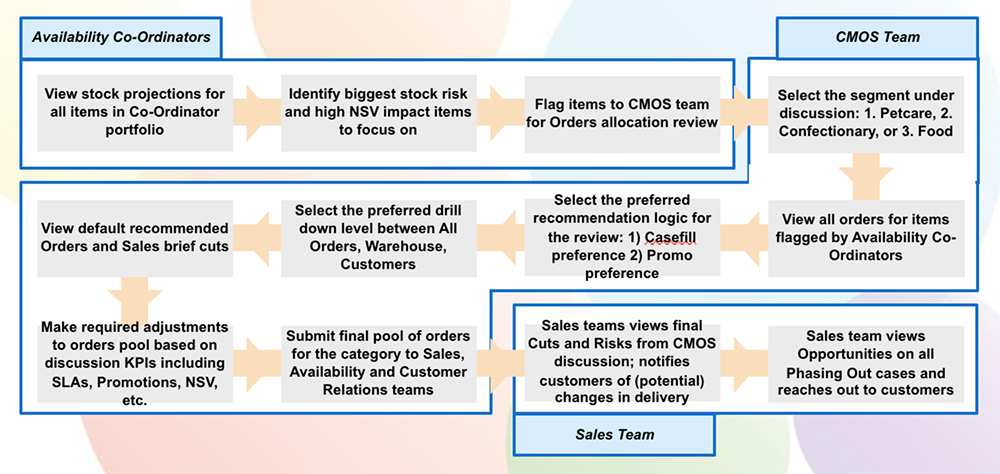
Using the insights from the user research, I redefined the problem statement to simplify the entire process, tasks involved, and problems they face during the entire workflow. The entire complicated process was eradicated and replaced with a new working way named 'the CARE way' - Concern, Accountability, Resolution, and Execution.


Task identification
We (I along with stakeholders, product owner and scrum master) brainstormed, conducted product semantics, sketched screens, and made a storyboard to try out features and ideas focusing on the users' needs found during research.
Solution approach
My approach was focused on a Goal-driven product instead of a Feature-first product. As we talked to users, we found the 4 different segments of users constitute the entire user base. Some of the use cases were individual goals while some were overlapping goals. So instead of working on features I started breaking small goals which can be used by all and place them in the application based on each role based login.
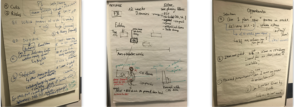
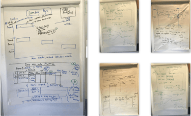
Sketches
I collaborated with my stakeholders, product owner and engineering team to do a white boarding session based on the initial pen & paper mockups
More ideas were generated for the visual design. Constraints were also highlighted.

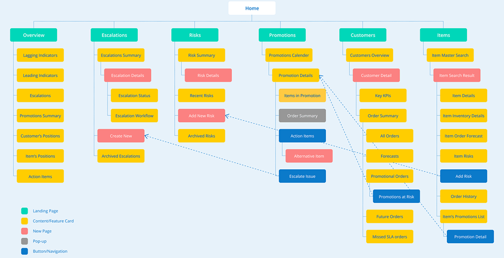
Information Architecture
Based on the initial brainstorming and sketches, I came up with the first version of Information Architecture which helped me to create the first version of wireframes and prototypes.
Usability Testing
I performed moderated, remote usability testing on the initial prototype created during the brainstorming session. I discovered a few insights and it also provided some of the user expectations regarding the flow of the application. The next obvious step was to perform card sorting to resolve those issues.
Findings -
1. Navigation flow issues
2. Missing features
Card Sorting
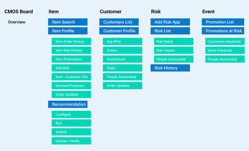
To improve the navigation and information architecture of the CMOS tool, we did Card Sorting. This helped us to categorise different features and then bucket them accordingly to improve user experience.
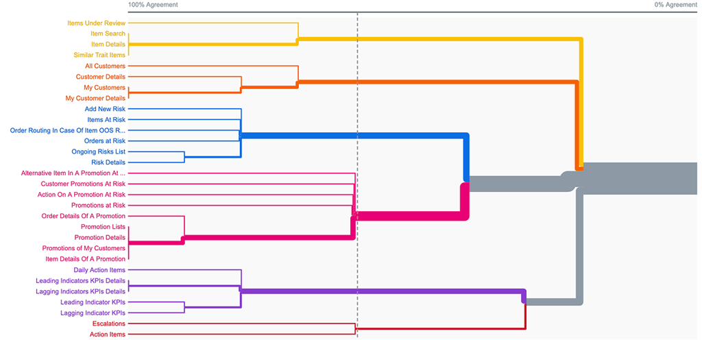
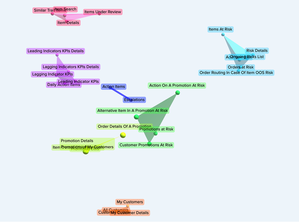
Information Architecture
After Usability Testing and Card Sorting, I updated the Information Architecture to get aligned with users needs and goals.
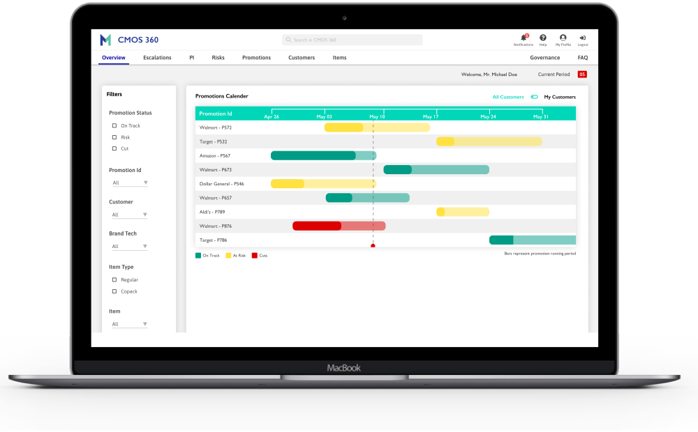
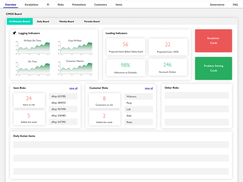
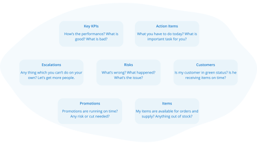
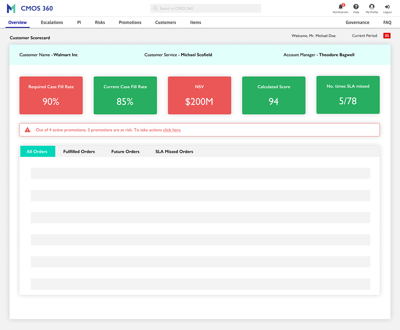
Principle of disclosure - I applied Principle of disclosure on the overview page to show just enough information to help people understand what kinds of information they’ll find as they dig deeper.
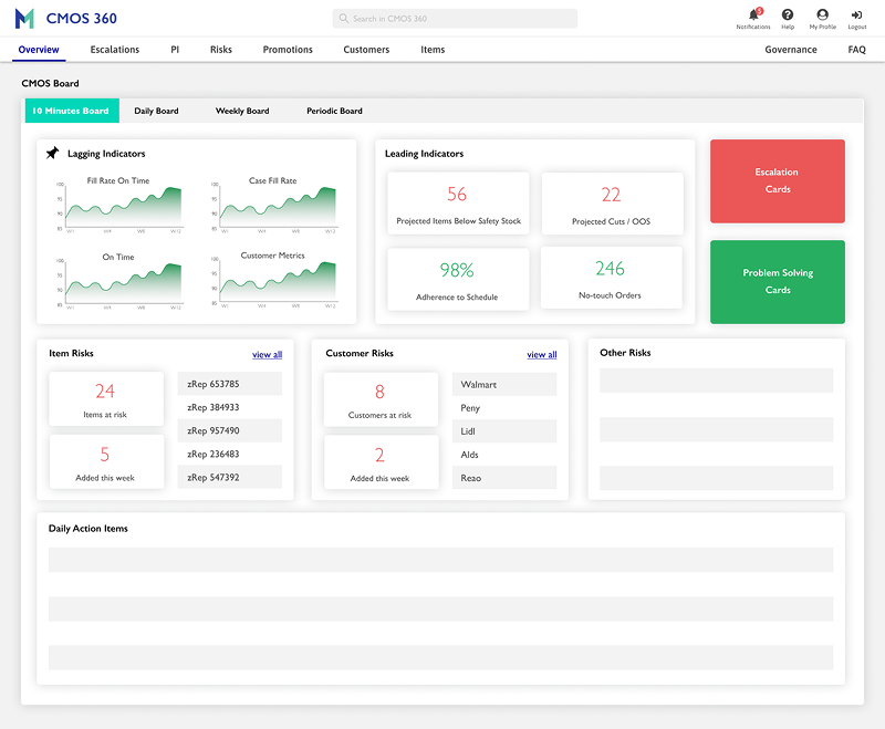
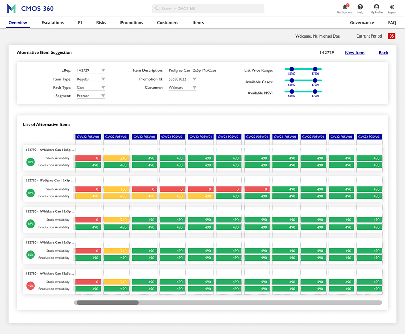
Design - Prototype


Outcomes
.


Impacts
Positive results and much more to do -
Alternative Items acceptance rates increased by 17% - availability of data, availability of new alternatives
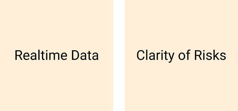
Risk Identification rates increased by 2 days - clarity of data and capability to identify and add risk
Cuts decreased by 12% - alternative items, advance intimation to customers
Accurate data on hand increased by 94% - data refresh is real-time instead of ad hoc spreadsheets
Time to get data on hand decreased by 35% - no need to jumble through multiple spreadsheets
Tools used for daily activities decreased by 76% - instead of multiple tools and spreadsheets, users are using a new tool along with a few spreadsheets if required
Learnings
This was the first time I did extensive UX research.
Although I was nervous at the beginning, I soon earned the trust of my stakeholders.
I coached my stakeholders about the importance of UX research, working backwards from the customer point of view
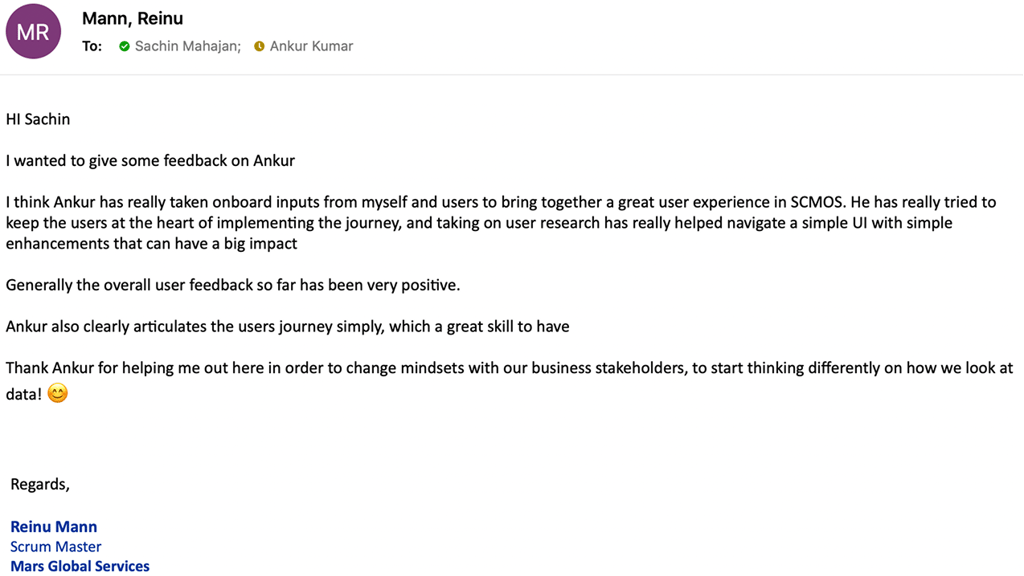
Feedback

© 2025 Ankur Kumar
Made with ❤️ in India
Powered by chai, curiosity & Kriti
People Before Pixels. Always.